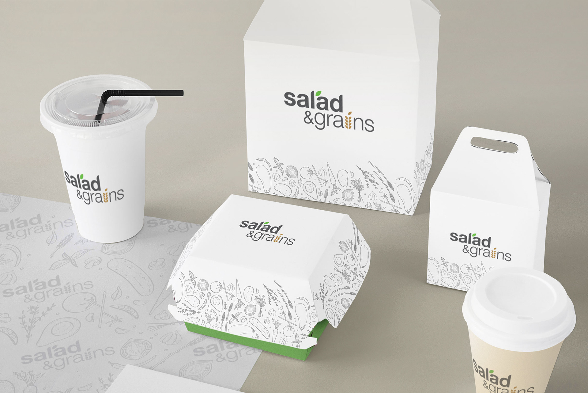
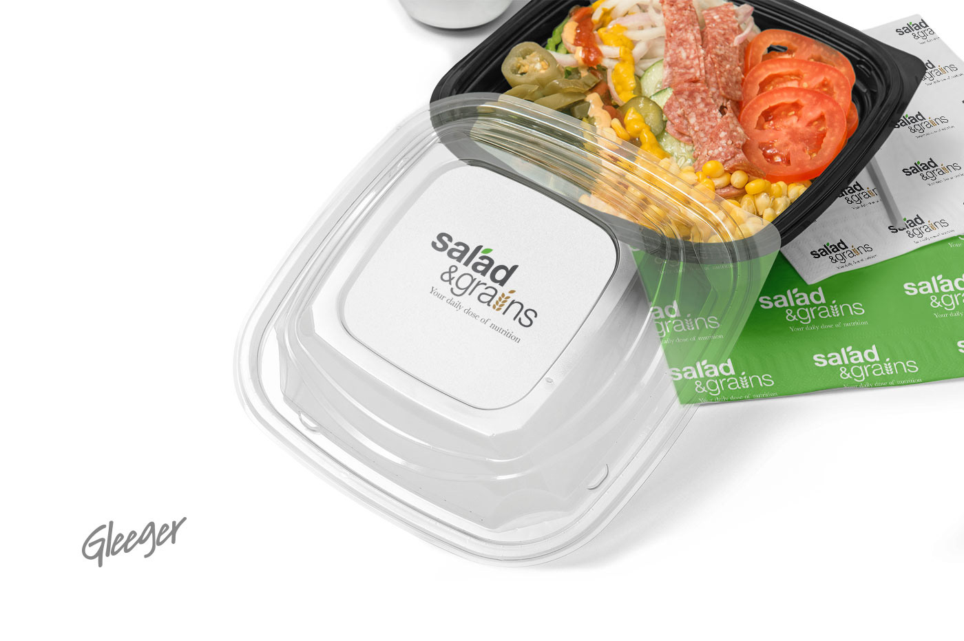
Salad & Grains
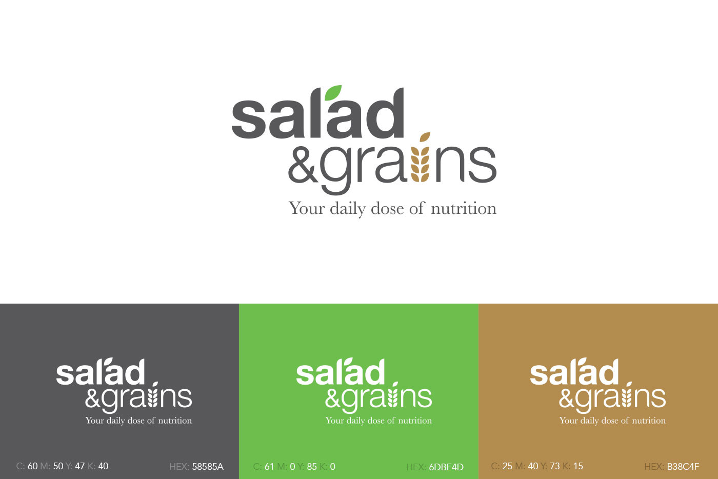
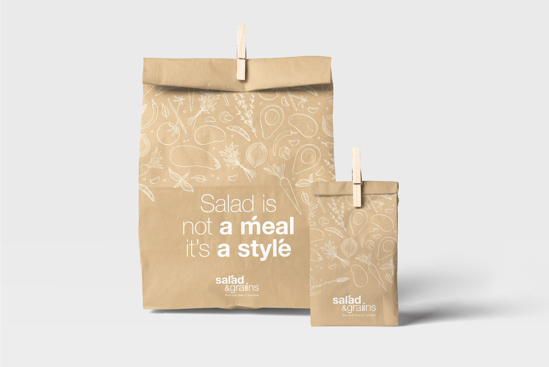
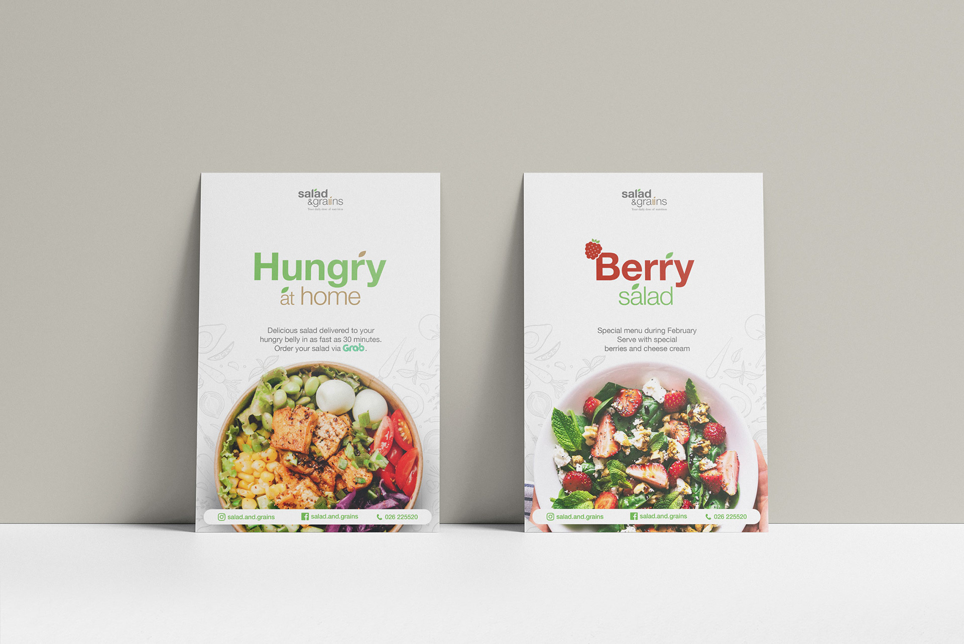
The whole point was to debunk the notion that health food is not delicious. The logo is simple with a dash of visual graphics to represent salad and grains above the logo text. With lavish use of colours, we brought out the myriad ingredients to stimulate the visual sense for the expected tastes from the dishes on the menu accompanied by well explained nutritional benefits. The stylish designs in the name card and service collaterals also capture the imagination of the younger customers the client was targeting.
Brand Identity | Animation